




Table of Contents Show
Fall weddings already have such a warm, romantic feeling, but the right color scheme can make the whole day feel even more special. The season gives you so much to work with, from deep fruit tones to soft browns, aged metals, dried florals, and candlelit details.
A good palette should feel beautiful in photos, but it should also fit the venue, the flowers, the outfits, and the mood you want your guests to feel when they walk in.
These fall wedding color schemes are made for couples who want something stylish, creative, and a little less expected. Some feel moody and dramatic, while others are soft, earthy, modern, or garden-inspired.
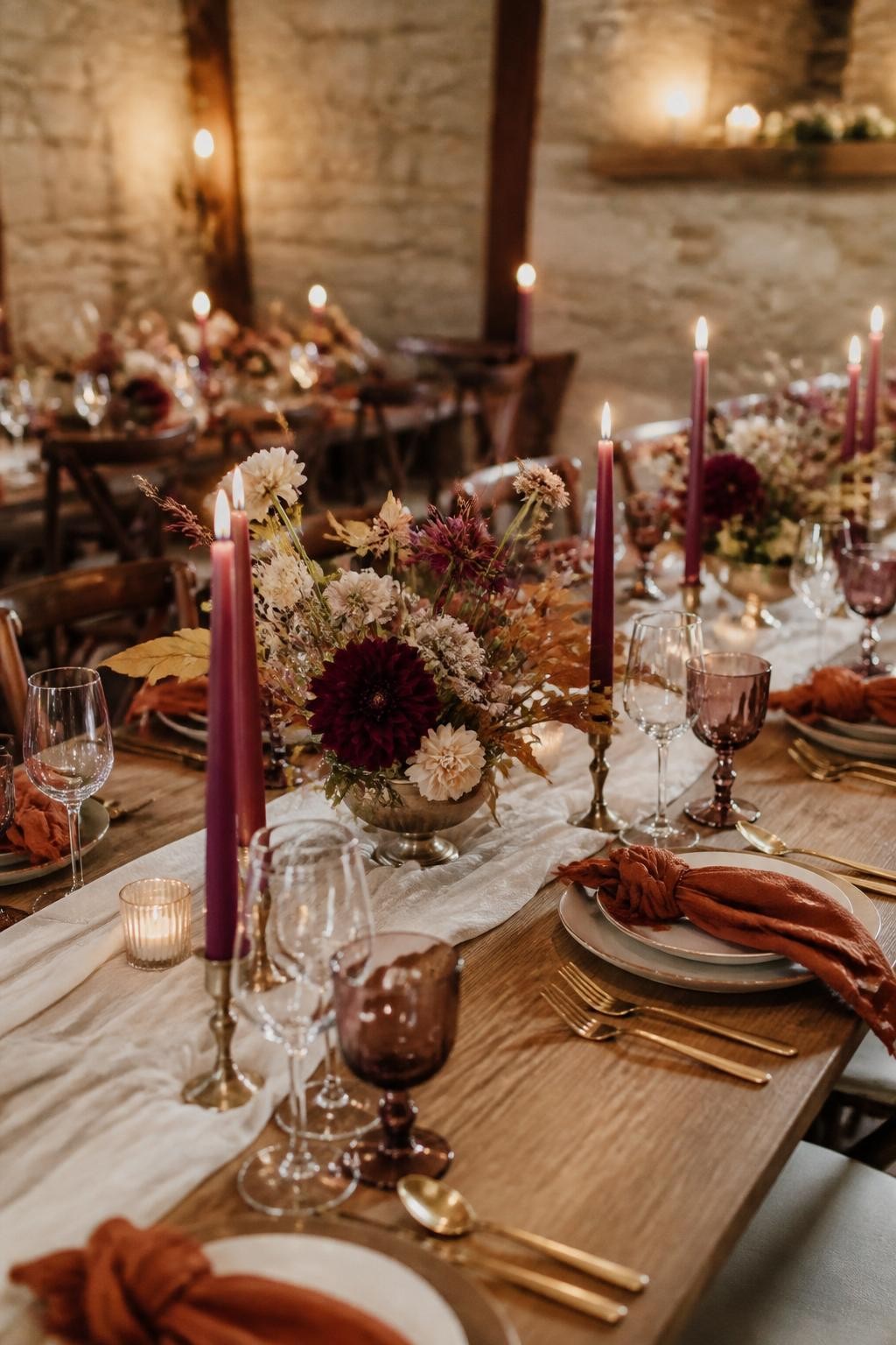
1. Burnt Sienna, Fig Purple, Antique Gold, and Candlelight Ivory
Tired of Natural Hair Breakage, Shrinkage & Tangles?
If your natural hair is always breaking, shrinking up, or taking forever to detangle, this ebook is for you. Learn simple ways to stop the damage and make wash days easier.
This palette feels rich without looking too heavy. Burnt sienna brings that true fall warmth, while fig purple adds a deeper romantic note that works beautifully for flowers, stationery, bridesmaid dresses, and candles.
Antique gold keeps the whole look polished, especially on flatware, frames, charger plates, and bar signs. Candlelight ivory softens the darker shades so the wedding still feels graceful and welcoming.
2. Chocolate Brown, Pear Green, Soft Cream, and Dark Espresso
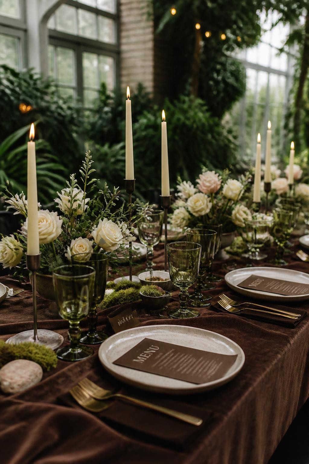
Chocolate brown is one of the most beautiful fall wedding colors because it feels warm, stylish, and expensive when used well. Pairing it with pear green gives the palette a fresh twist instead of making it feel too dark.
Soft cream is perfect for flowers, tablecloths, cake details, and bridal party accents. Dark espresso can show up in wax seals, signage, shoes, ribbons, and groom styling for a clean, thoughtful finish.
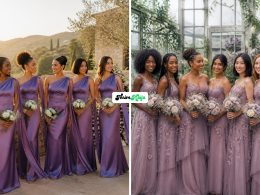
3. Mulberry, Dusty Rose, Smoked Mauve, and Champagne
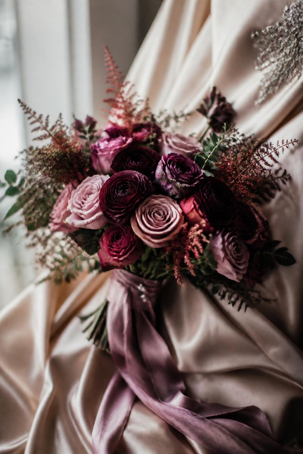
This is a lovely choice for couples who want a fall wedding that feels romantic but not overly dark. Mulberry gives the palette depth, while dusty rose and smoked mauve keep it soft and wearable.
Champagne works beautifully for bridesmaid dresses, linens, shoes, and glassware. This color scheme is especially pretty for estate weddings, garden venues, and indoor receptions with warm lighting.
4. Moss Green, Mushroom Taupe, Porcelain White, and Black Olive
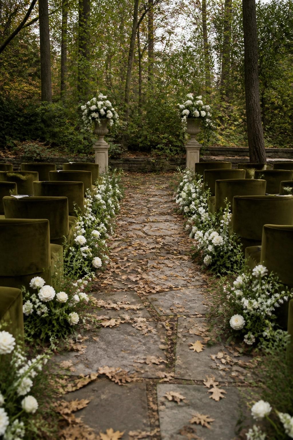
This palette is perfect for couples who love nature but want a more refined version of a woodland wedding. Moss green brings in the outdoor feeling, while mushroom taupe adds softness and texture.
Porcelain white keeps the design clean and bridal. Black olive gives the palette a quiet edge, especially when used for candles, menus, suits, or thin ribbon details.
5. Cranberry Red, Copper, Oatmeal, and Rosewood
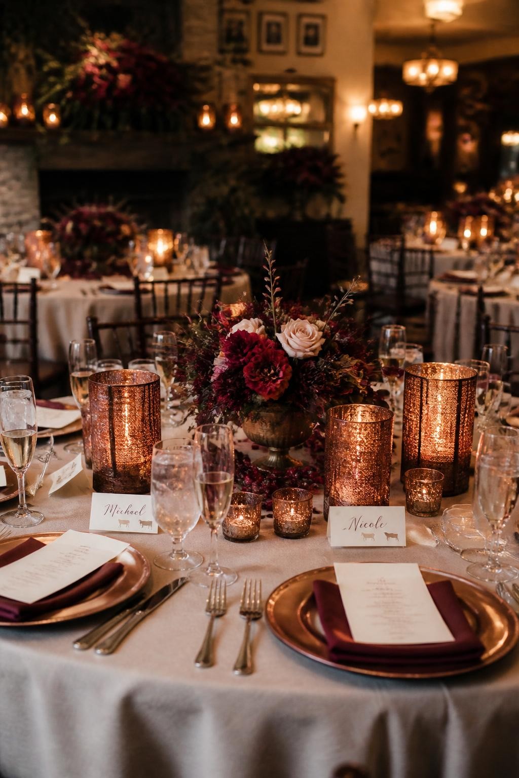
Cranberry red is bold, but it feels beautiful for fall when it is balanced with softer shades. Copper adds glow and works well with candle holders, barware, table numbers, and small decor accents.
Oatmeal keeps the palette from feeling too loud. Rosewood adds a natural brown-red tone that looks lovely in wood furniture, invitation borders, bridesmaid dresses, and floral stems.
6. Butterscotch, French Blue, Toasted Almond, and Cream
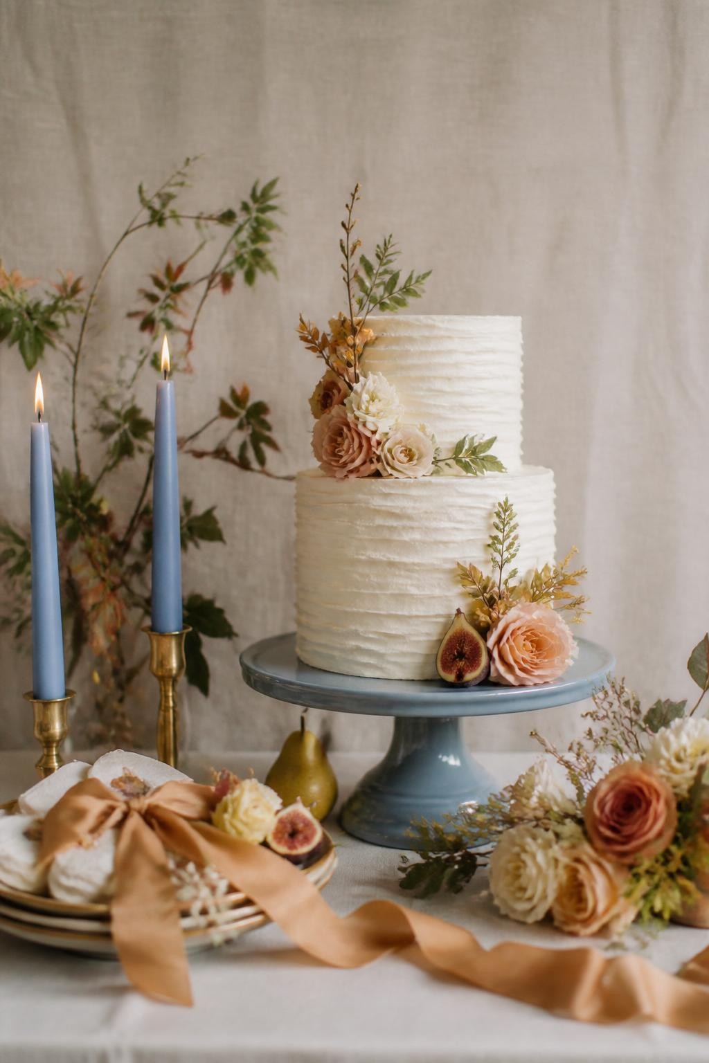
This palette feels fresh for fall because it moves away from the usual orange and burgundy mix. Butterscotch gives warmth, while French blue adds a cool, stylish contrast that photographs beautifully.
Toasted almond and cream make the colors feel smooth and soft. This is a great scheme for couples who want fall warmth but still want something bright, clean, and modern.
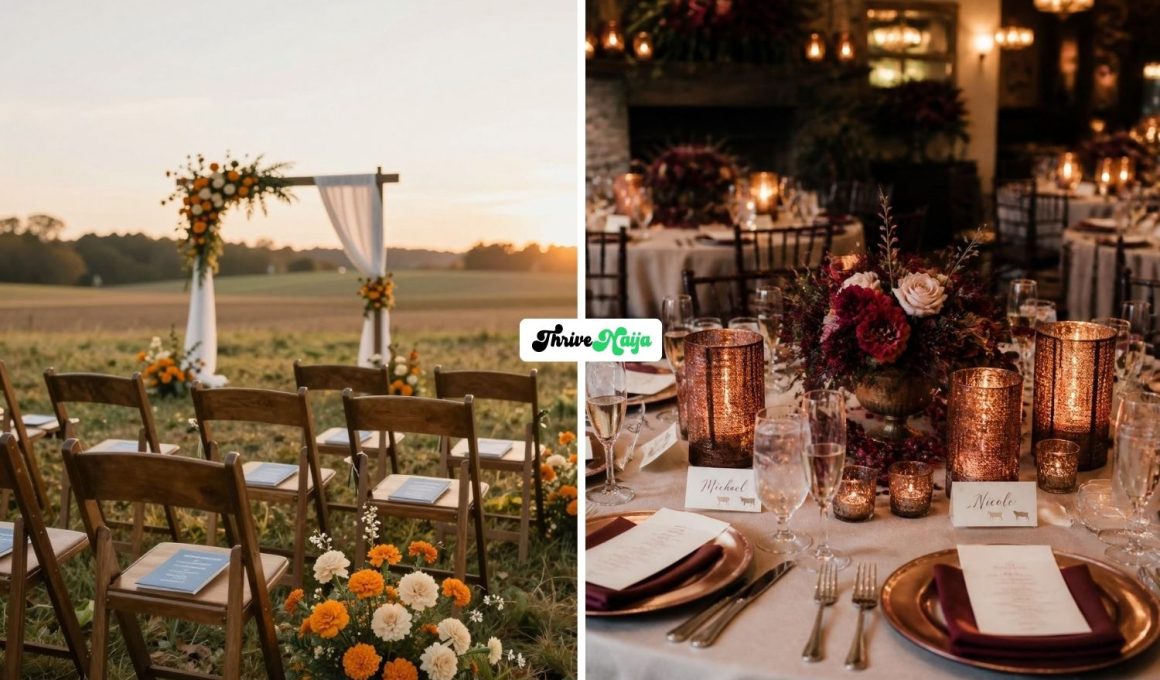
7. Terracotta, Plum, Clay Pink, and Dried Wheat
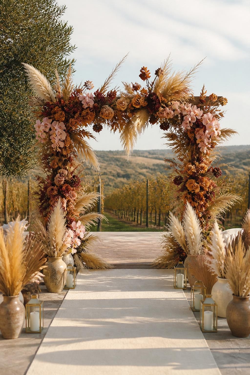
Terracotta is a fall favorite, but adding plum and clay pink makes it feel more interesting. The mix feels earthy, romantic, and slightly artistic without being too bold for a wedding.
Dried wheat gives the palette texture and a clear fall feeling. Use it in ceremony arches, bouquets, place settings, and aisle decor for a look that feels warm and natural.
8. Fresh Chartreuse, Walnut Brown, Bone White, and Smoked Amber
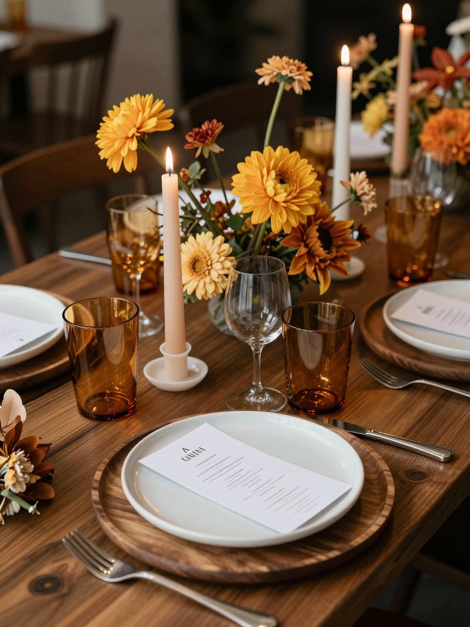
Chartreuse can sound daring, but it looks beautiful in small, thoughtful touches. It brings a fresh pop to fall colors and works well with orchids, anthuriums, pears, glassware, and modern stationery.
Walnut brown grounds the palette so it still feels seasonal. Bone white and smoked amber help everything feel warm, grown-up, and stylish instead of too bright.
9. Midnight Navy, Merlot, Burnished Brass, and Fog Gray
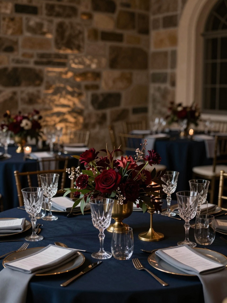
This color scheme is made for a formal fall wedding or an evening reception. Midnight navy gives the palette depth, while merlot adds romance and warmth.
Burnished brass brings a soft glow without feeling too shiny. Fog gray is the quiet shade that ties everything together, especially in napkins, suits, envelopes, and stone-inspired decor.
10. Pumpkin Spice, Apricot, Dusty Lilac, and Cocoa
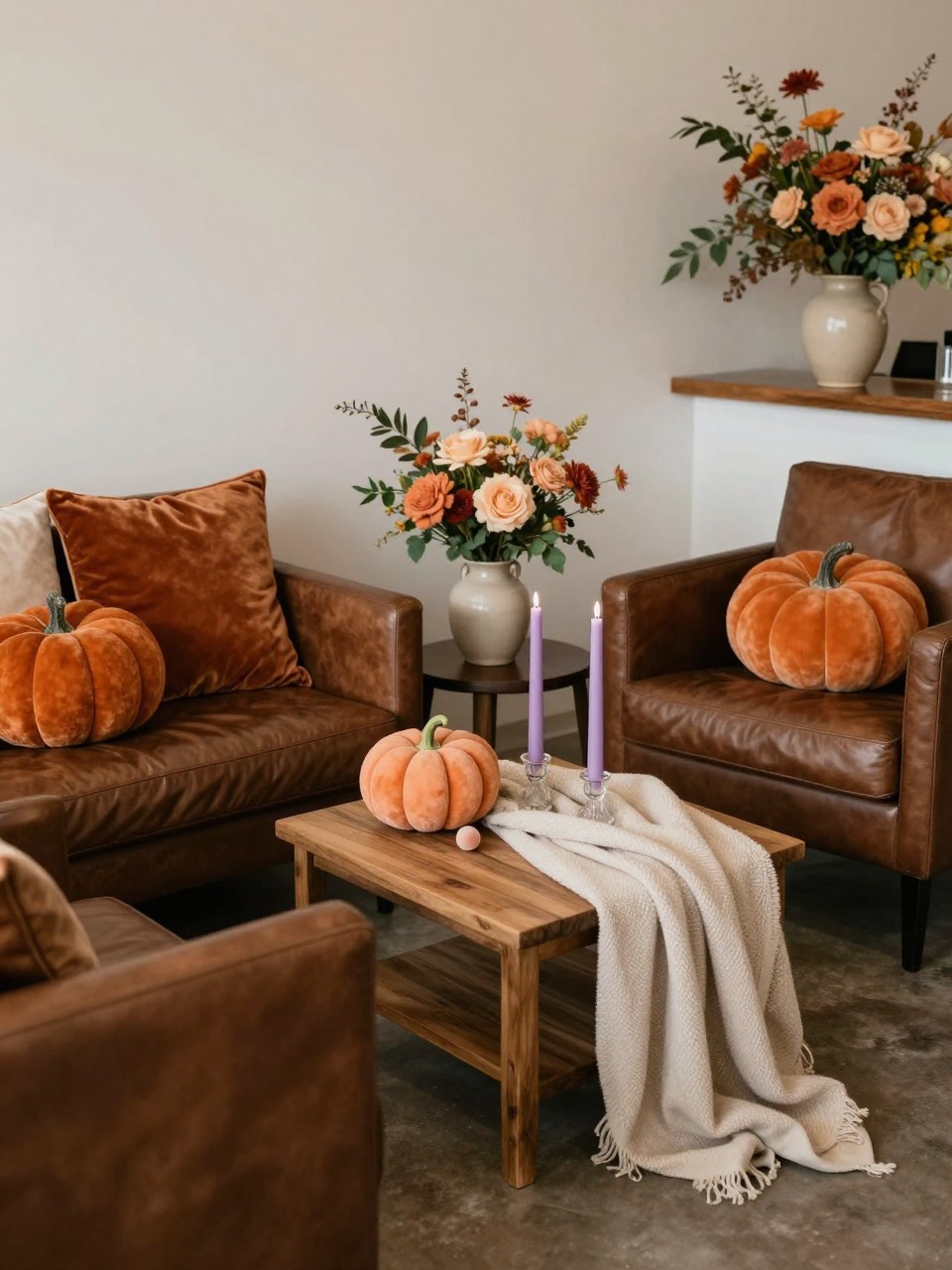
This is a playful fall palette that still feels pretty and wedding-ready. Pumpkin spice brings the seasonal warmth, while apricot makes it softer and more romantic.
Dusty lilac is the surprise color here. It cools the palette down and gives it a creative, fashion-forward touch, while cocoa adds depth through furniture, menus, candles, and cake details.
11. Olive Green, Saffron, Deep Teal, and Linen
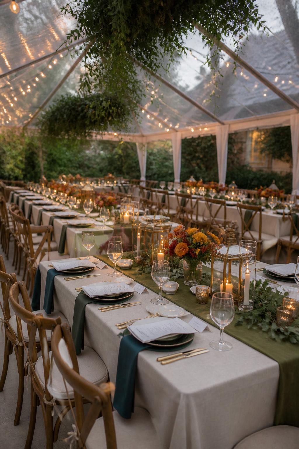
Olive green and saffron feel warm and natural together, but deep teal makes the palette feel more layered. This is a good choice for couples who want color without going too bright.
Linen keeps the scheme grounded and easy to style. Use deep teal for bridesmaid dresses, napkins, or signage, then keep saffron in flowers, fruit, candles, or cocktail hour details.
12. Blackberry, Honey Gold, Soft Stone, and Charcoal
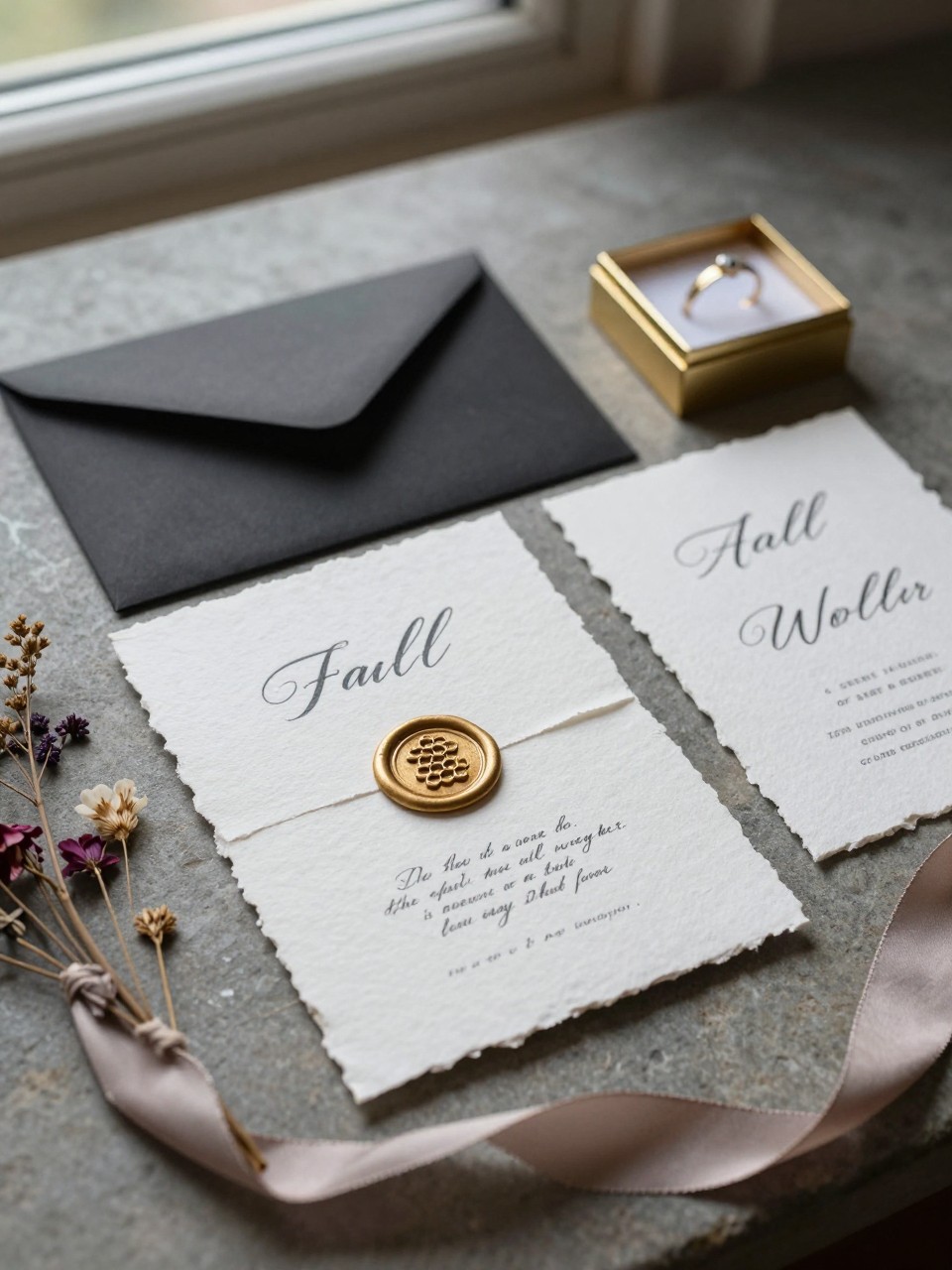
Blackberry is a beautiful fall shade because it feels deep, rich, and romantic. Honey gold adds warmth and stops the darker color from feeling too serious.
Soft stone gives the palette a calm base, while charcoal adds a modern finish. This color scheme works well for art gallery weddings, old buildings, private estates, and candlelit dinner receptions.
13. Rust, Ballet Pink, Espresso, and Warm Ivory
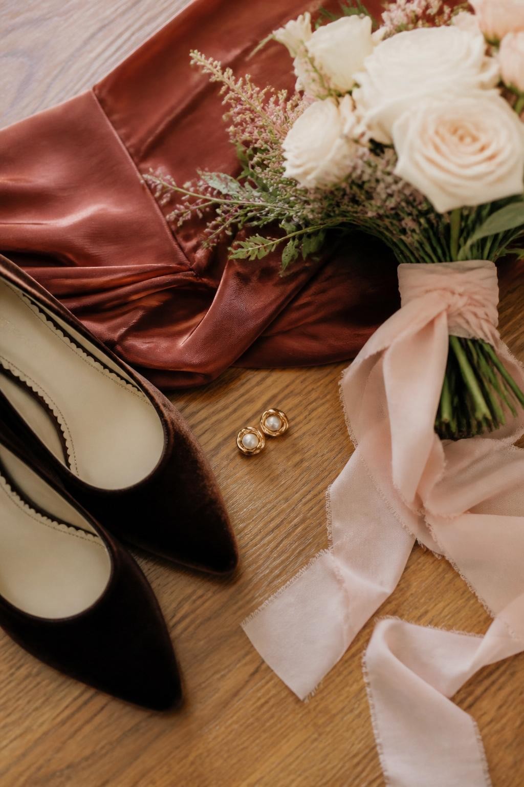
Rust and ballet pink are a sweet mix because one feels earthy and the other feels soft. Together, they create a fall palette that feels romantic without being too sugary.
Espresso adds a deeper shade that can be used in suits, shoes, chairs, signage, or table details. Warm ivory keeps the overall look bridal and timeless.
14. Pomegranate, Stone Blue, Pale Gold, and Cream
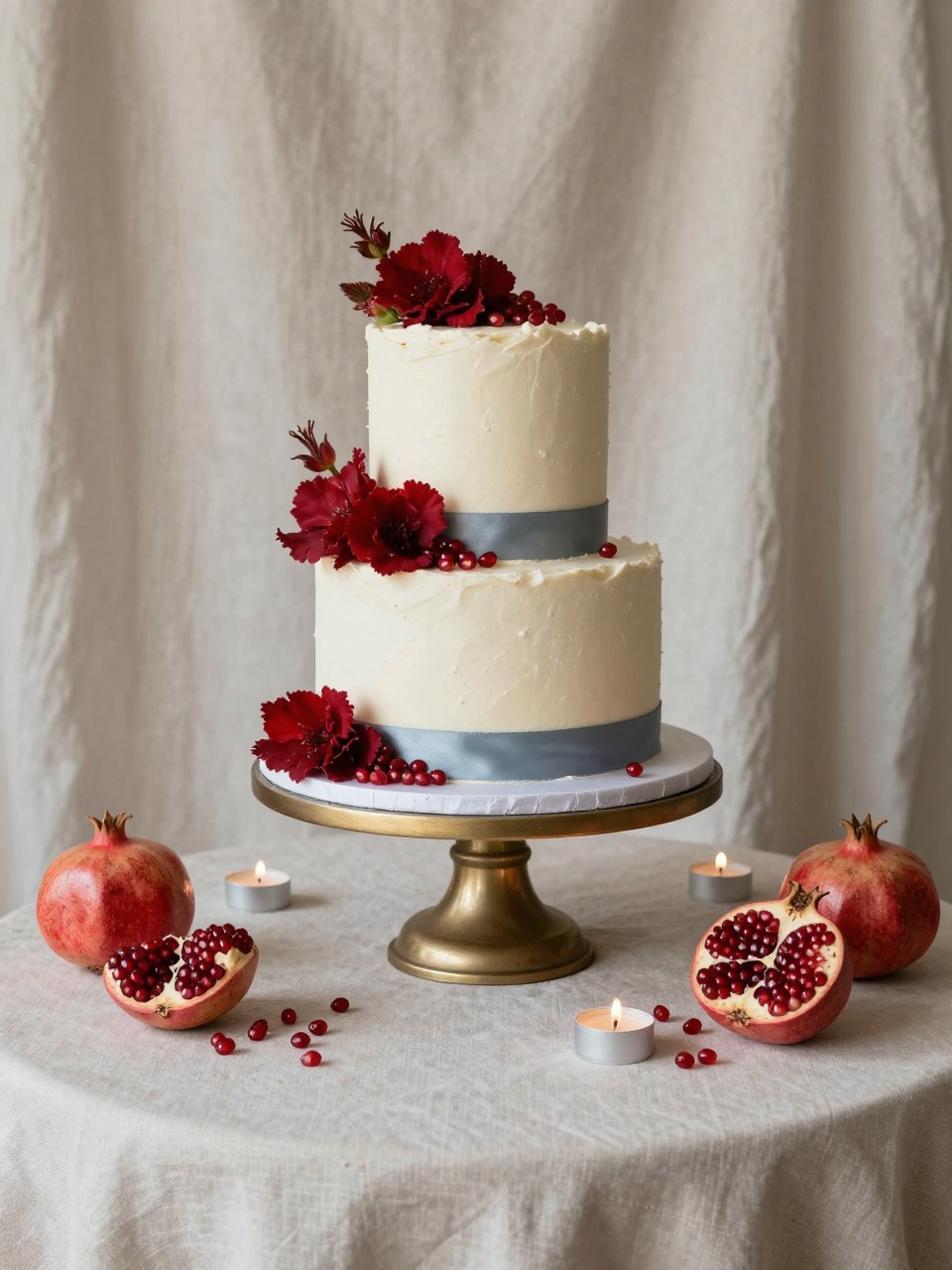
Pomegranate is bold and beautiful for fall, but stone blue gives it a cooler and more unexpected look. This mix feels both romantic and artistic, especially when used in florals and paper goods.
Pale gold adds a soft shine, while cream makes the palette feel balanced. This color scheme is great for couples who want a red wedding palette that does not feel too classic or holiday-like.
15. Burgundy, Mushroom Gray, Apple Green, and Toasted Cream
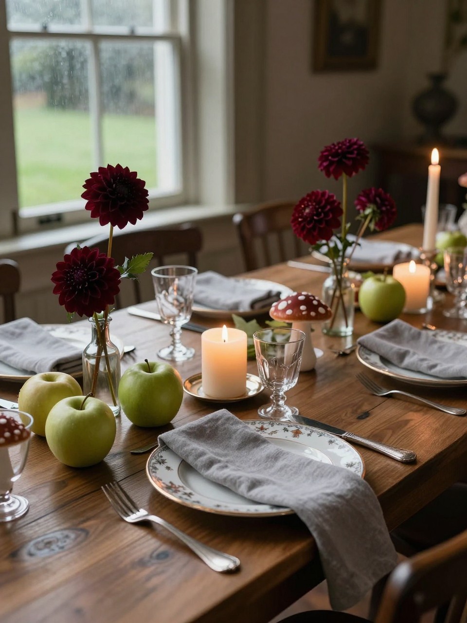
Burgundy is a strong fall wedding color, but apple green gives it a fresh and unexpected lift. Mushroom gray softens the contrast so the palette feels more thoughtful and less traditional.
Toasted cream is perfect for candles, linens, cake, and flowers. This scheme works beautifully for manor weddings, garden dinners, and fall receptions with old-world details.
16. Cinnamon Brown, Cloud Blue, Marigold, and Soft Ivory
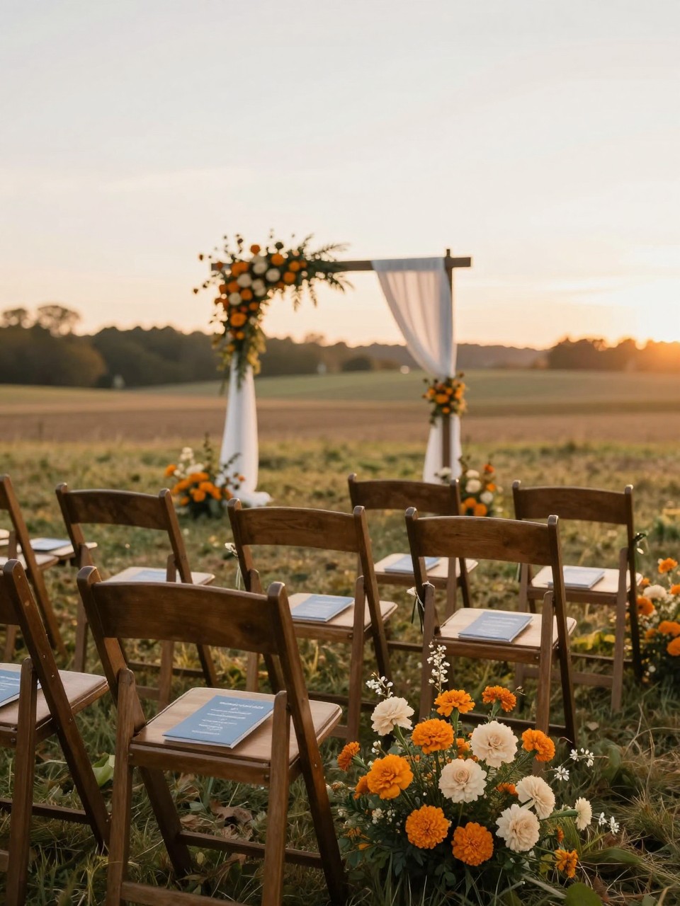
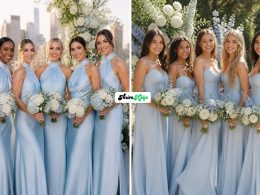
Cinnamon brown feels warm and seasonal, but cloud blue makes the palette feel lighter and more modern. This is a nice choice for couples who love fall colors but do not want the whole wedding to feel dark.
Marigold adds a cheerful golden note that works well in flowers, napkins, and small decor pieces. Soft ivory keeps everything calm and helps the stronger shades feel wedding-appropriate.
17. Garnet, Blush Beige, Smoked Plum, and Old Silver
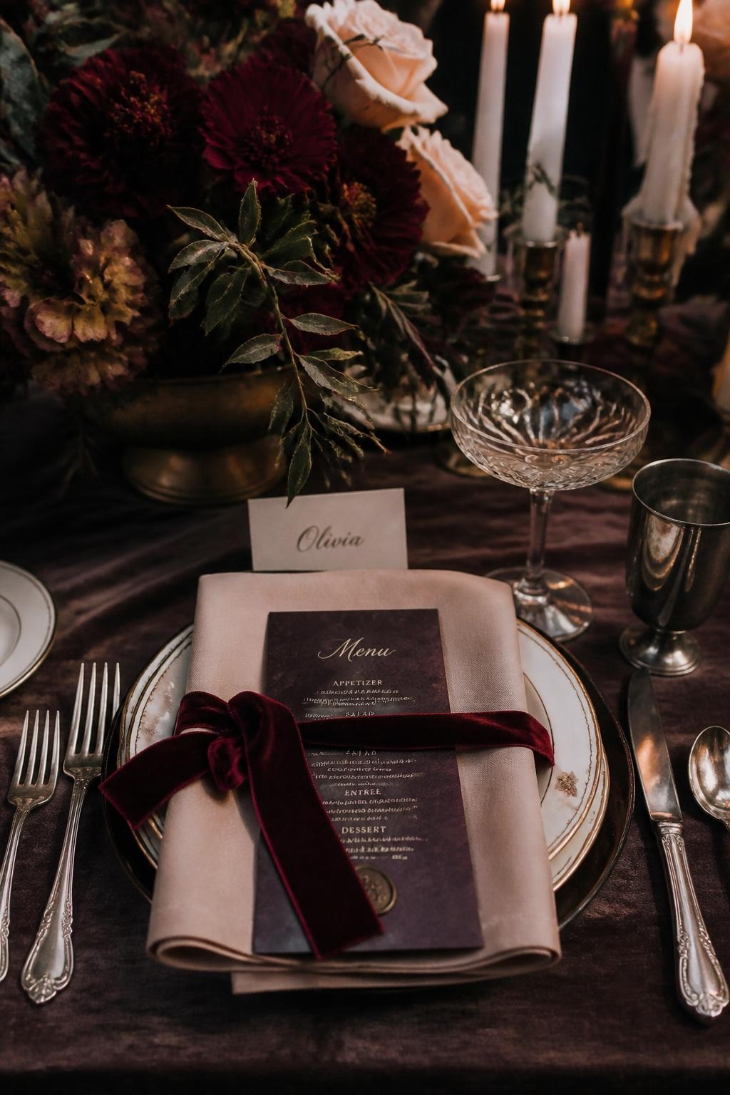
This palette feels romantic, moody, and a little vintage. Garnet gives the look drama, while blush beige softens it enough for a wedding ceremony or dinner reception.
Smoked plum adds depth without clashing with the red tones. Old silver is a beautiful choice for flatware, candle holders, frames, and cake stands, especially in historic venues.
18. Maple, Dusty Lavender, Chestnut, and Pearl White
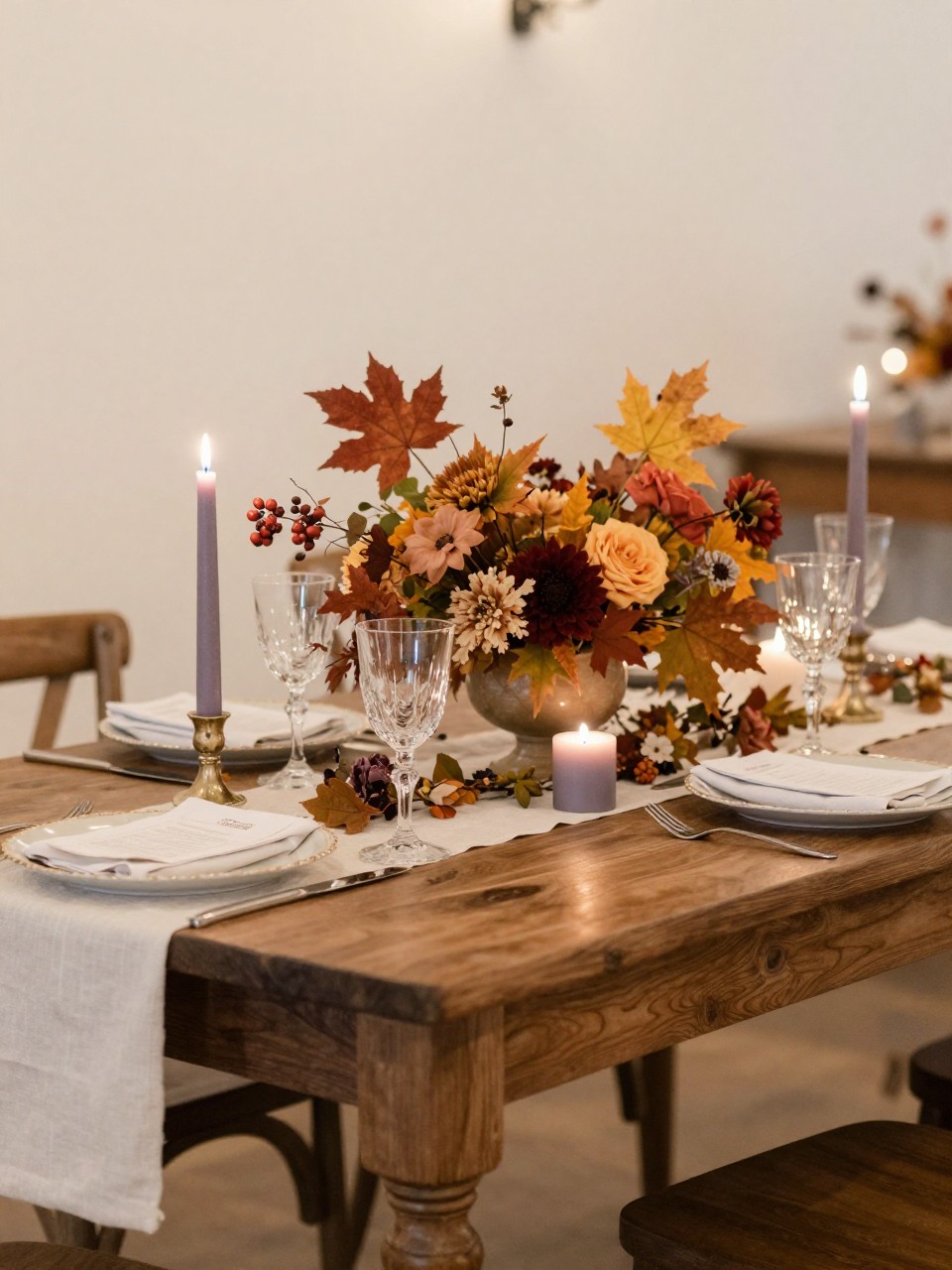
Maple and chestnut bring the cozy side of fall, while dusty lavender adds softness and charm. It is a lovely palette for couples who want something gentle but still seasonal.
Pearl white gives the design a clean bridal feel. Use dusty lavender in candles, ribbons, stationery, and bridesmaid dresses, then keep maple and chestnut in flowers, wood, and small table details.
19. Black Cherry, Camel, Cream, and Dark Sage
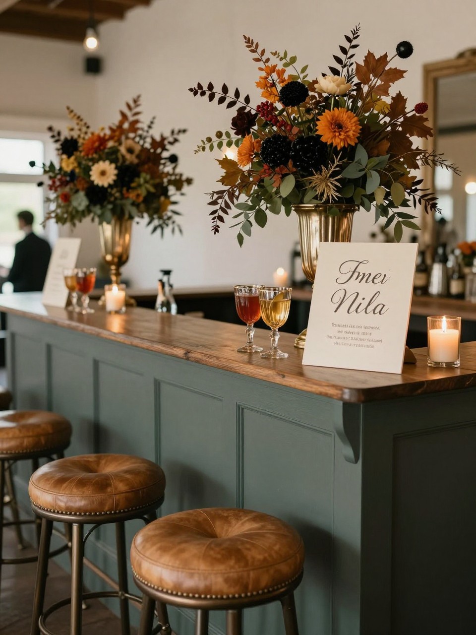
Black cherry is deeper than red and softer than burgundy, which makes it feel very chic for fall. Camel adds warmth and gives the palette a fashion-inspired feel.
Cream helps brighten the darker tones, while dark sage adds a natural finish. This color scheme looks especially good in lounges, cocktail bars, welcome signs, and dinner settings.
20. Amber, Eggplant, Antique Rose, and Warm Taupe
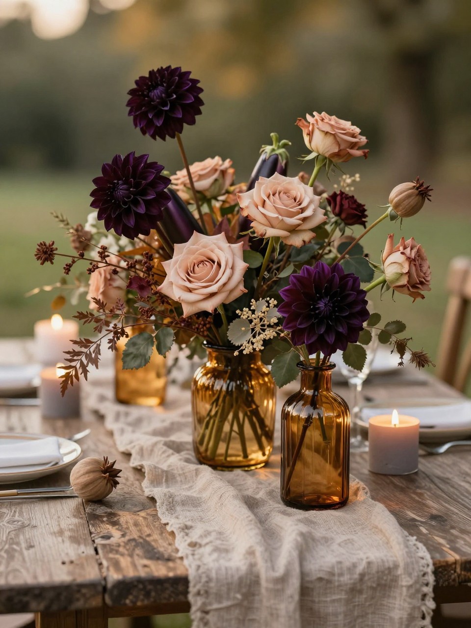
Amber and eggplant make a strong fall pairing because one feels warm and glowing while the other feels deep and romantic. Antique rose softens the mix so it does not look too heavy.
Warm taupe is the perfect base for linens, envelopes, ceremony fabrics, and bridesmaid accessories. This palette works beautifully for vineyard weddings, barn weddings, and intimate indoor dinners.